
What happens when AI learns to listen to culture
How specialized AI agents localize language, redesign interfaces, and apply cultural UX heuristics — all in one system.

During the week, I’m deep in the trenches of real localization work: aligning terminology, untangling messy TMs, debugging international builds, fine-tuning workflows so global launches actually land smoothly. But on weekends, I give myself permission to zoom out, and imagine where localization should be heading. Instead of staring at a spreadsheet, I imagine the bigger picture: What would it look like if our localization systems truly understood culture?
This post is one of those reflections: a vision of what AI-powered systems could look like if they didn’t just translate text but understood culture, shaping language and interface to resonate deeply with each market.

Hi, I’m Julia Díez. By day, I build the guardrails for global launches. By night (and weekends), I imagine what localization could become.
Traditional localization treats UI adaptation and linguistic translation as separate problems. You translate the strings, hand them to engineers who maybe—maybe—adjust layouts for text expansion, and ship something that’s technically correct but culturally tone-deaf.
We often say: “Understand your users.” But when entering a new cultural context, user interviews alone can’t give you the full picture. You can learn what users do, but not necessarily why they do it that way.
Japan illustrates this beautifully. To understand why Japanese digital interfaces are so dense, why layouts feel structured and hierarchical, or why information is conveyed in a certain way, you have to go back not just decades, but centuries.
Two Philosophies, Two Ways of Seeing
Western design culture inherits its roots from ancient Greece: independent communities, debate, and a focus on objects. Greek philosophers like Plato and Aristotle were obsessed with defining the essence of things. Truth was something you argued toward.
Meanwhile, Chinese philosophy focused on relationships and harmony. It was about the way, not the object. This holistic perspective flowed into Japan around the 6th century and became foundational to its cultural DNA.
The result:
Western cultures tend to focus on the figure: the button, the headline, the CTA.
Eastern cultures (Japan included) tend to focus on the field: the relationships between elements, the context that gives meaning.
This is visible in art, children’s drawings, and—yes—websites.
A Higher Horizon, Literally
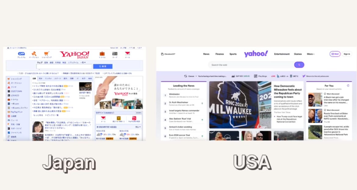
Studies show that East Asian painters placed the horizon higher in their landscapes than Western painters, to fit more contextual information into the frame. This holistic mindset persists: Japanese drawings, photographs, and UIs all pack more elements into a scene.
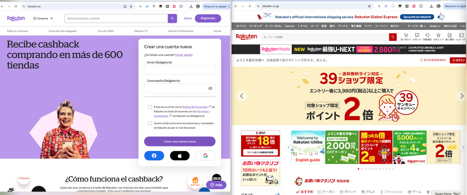
Compare Rakuten Spain’s homepage to Rakuten Japans’s. One is minimalistic, airy, and figure-focused. The other is text-rich, context-dense, and information-forward. Both are “good design” — but they’re optimized for different ways of seeing.
The Writing System Shapes the Interface
Japan’s writing system is a fascinating blend of Kanji (Chinese characters), Hiragana, Katakana, and Arabic numerals. This mix creates unique design constraints and possibilities:
No italics or capital letters: Designers use decoration or layout to create hierarchy.
Logograms: One character can convey complex meaning, allowing users to read quickly without subvocalizing.
Typing complexity: With thousands of characters, typing is cumbersome. So instead of search bars, Japanese websites rely heavily on link-based navigation.
The result: more text, more links, denser layouts. What looks “cluttered” to a Western eye is actually optimized for a different reading and browsing rhythm
Risk, Ritual, and Information Density
Japan is a country shaped by natural threats—earthquakes, tsunamis, typhoons—and centuries of ritualized responses. Over time, this cultivated a cultural preference for predictability, detailed protocols, and uncertainty avoidance.
In UX terms: the more information you provide, the safer and more trustworthy a product feels. Japanese websites often overwhelm Western designers at first glance, but to Japanese users, this information-rich approach is reassuring, not confusing.
The Vision: Culturally-Intelligent Localization Architecture
I’m proposing an AI-powered system that treats localization as a holistic problem: linguistic adaptation and UI transformation working together, informed by actual cultural UX expectations.
This isn’t science fiction. The tools exist today. Here’s how I’d build it (Any sponsor out there?)
Breaking Down the Architecture
The Two Core Capabilities
Your system needs to handle two parallel but interconnected tasks:
1. Linguistic Adaptation
Using multilingual LLMs with glossary management and tone control to go beyond translation into transcreation—adapting messaging for cultural resonance while maintaining brand voice.
2. UI Adaptation
Leveraging LLMs augmented with design heuristics and layout constraints to propose interface changes based on locale-specific UX expectations.
The Input/Output Flow
Input:
Figma files or structured JSON containing English UI strings
Component metadata (layout, hierarchy, labels, spacing constraints)
Context about each string’s purpose and placement
Output:
Culturally adapted strings with appropriate tone, formality, and length
Redesigned UI proposals per locale (Figma updates or design tokens)
Rationale for each adaptation decision
The Four Essential Modules
1. String Localizer Agent
Goes beyond simple translation to handle transcreation with context awareness. Feed it:
The source string
UI context (button, header, error message)
Target locale and brand guidelines
Tone requirements (formal, casual, urgent, friendly)
The agent doesn’t just translate—it adapts. “Sign up for free!” might become more formal and value-focused in German markets, more relationship-oriented in Latin American contexts, or more information-dense in Japanese.
2. Cultural UX Evaluator
Analyzes interface components against locale-specific design expectations:
Color psychology and cultural associations
Icon appropriateness and symbolism
Information density preferences
Visual hierarchy norms
White space expectations
This module draws from a knowledge base of market-specific UX heuristics, essentially codifying what experienced international designers know intuitively.
3. Layout Recommender
Proposes concrete design changes based on:
Text expansion/contraction ratios
Reading direction (LTR vs RTL)
Cultural preferences for information density
Navigation pattern expectations
Form design conventions
For example, it might recommend moving a centered CTA to the top-right for Japanese markets, condensing three-line copy to one line, and reducing padding to match local expectations for interface density.
4. Figma/Code Integrator
Handles the technical bridge between AI recommendations and your actual design/development workflow:
Pulls from Figma API or component libraries
Pushes updates back as variants or design tokens
Integrates with tools like Tokens Studio for code synchronization
Generates variant components rather than destructive edits
Data Requirements: Garbage In, Gospel Out
Your AI agents are only as good as the context you provide:
String Context:
Key identifiers with semantic meaning
UI placement and component type
User journey stage
Desired user action or emotion
Locale-Specific UX Intelligence:
Market research on design preferences
Visual examples from successful local products
Cultural guidelines (colors, symbols, taboos)
Reading pattern studies (F-pattern vs Z-pattern vs other)
Visual Context:
Annotated Figma files as training examples
Before/after case studies from successful localizations
Competitor analysis from each market
Prompt Engineering for Localization
The magic happens in how you structure agent prompts. Here’s an example for translation:
json
{
  “input”: “Sign up now to get your free trial!”,
  “locale”: “ja-JP”,
  “context”: “CTA button on homepage, appears after feature demonstration”,
  “instructions”: “Be formal but inviting. Match minimalist brand voice. Consider that Japanese users are skeptical of ‘free’ offers—emphasize trial value. Keep to one line, max 12 characters if possible.”,
  “constraints”: {
    “tone”: “professional-friendly”,
    “max_length”: 20,
    “avoid_katakana_overuse”: true
  }
}
For UI transformation:
Given the original English layout (Signup CTA centered, two-line text, ample whitespace)
and the target market (Japan, where users expect denser information and structured layouts),
recommend: CTA repositioning, text compression strategies, padding adjustments,
and any additional UI elements that would increase trust (security badges, social proof).
Explain cultural reasoning for each change.
A Practical Tech Stack
Here’s what I’d recommend building this with today:
Design Integration:
Figma Plugin + Figma API for reading/writing designs
Design tokens (Style Dictionary, Tokens Studio) for code sync
AI Orchestration:
LangChain or LangGraph for multi-agent workflows
OpenAI GPT-4, Claude, or Mistral for reasoning tasks
Specialized translation models from Hugging Face (optionally fine-tuned on your domain)
Knowledge Management:
Vector database (Pinecone, Weaviate) for UX heuristics retrieval
Rule-based system for hard constraints (RTL, legal requirements)
Version control for locale-specific design guidelines
Integration Layer:
REST APIs to your CMS/TMS
Webhooks for design file updates
CI/CD integration for automated variant generation
Market-Specific Adaptation Patterns
Japan is a vivid example because its UX culture is so distinct. But every market has layers like this: linguistic, historical, social, philosophical. Whether it’s Germany’s precision, Brazil’s warmth, or Arabic markets’ visual symbolism, each culture has its own UX grammar.
🇩🇪 Designing for German: Precision Meets Structure
German UI adaptation goes beyond translating text, it’s about designing with linguistic density, cultural preferences, and legal expectations in mind from the very start.
German compound words like Datenschutzeinstellungen (privacy settings) or Zahlungsabwicklung (payment processing) can quickly overflow buttons, menus, or mobile layouts. Interfaces need flexible grids, responsive components, and sometimes alternative phrasing to keep designs clean without sacrificing clarity.
Visually, German users value structured layouts, subtle color palettes, and professional restraint over playful or overly bright designs. Detailed, trustworthy information is expected: sparse or vague copy often underperforms.
Finally, Germany’s strict legal environment (GDPR, Accessibility Act 2025) shapes UX at a structural level. Privacy options must be designed into the interface early, accessibility is mandatory, and sustainable, data-conscious design is increasingly the norm.
The takeaway: In German markets, linguistic precision, clarity, and compliance are design elements, not afterthoughts.
🇸🇦 Arabic Markets:
Designing Arabic user interfaces isn’t just about flipping layouts, it’s about rethinking structure, typography, and cultural context so the experience feels natural for RTL (right-to-left) audiences.
First, implement RTL layouts properly: navigation should begin on the right, progress bars move right-to-left, and directional icons must mirror their LTR counterparts. Typography plays a key role too. Arabic scripts require dedicated fonts (like Cairo, Tajawal, or Rubik), careful testing across devices, and support for bi-directional input as users often switch between Arabic and English keyboards.
Cultural relevance matters: imagery, colors, and motifs should reflect local values. Green signals spirituality and prosperity, gold tradition and luxury, white purity, and red struggle. Geometric patterns and calligraphic flourishes can subtly enrich designs when used sparingly.
🇧🇷 Brazil:
UI design in Brazil reflects the country’s vibrant culture and its fast-evolving UX landscape. Brazilian users respond well to warm, expressive interfaces with bold colors, high contrast, and conversational tones that foster a sense of closeness and trust. Interfaces that feel too cold or corporate can come across as distant.
Communication styles are typically more circumspect and indirect than in the U.S. or Northern Europe, something to consider when testing or giving feedback.
Above all, successful UI in Brazil blends human warmth with practical clarity. Designs that invite interaction through approachable language, vibrant visuals, and intuitive flows tend to resonate best with Brazilian audiences.
The Workflow in Action
Upload: Designer drops Figma file or JSON export into system
Extract: System parses components, strings, layout metadata
Localize: Translation Agent adapts each string with full context
Evaluate: UX Agent analyzes against market-specific heuristics
Redesign: Layout Agent proposes specific UI changes with rationale
Review: Pushed back to Figma as variants for human review
Iterate: Reviewers accept, reject, or modify; feedback trains future iterations
Once your foundation works, consider:
Visual Attention Heatmap Simulator:
Predict how users from different cultures will scan your interface using eye-tracking research patterns. Adjust layouts accordingly.
Continuous Learning Loop:
Track which AI recommendations get accepted vs rejected. Use this to improve future suggestions. A/B test results feed back into the heuristic database.
Competitive Intelligence Integration:
Automatically analyze how successful local competitors structure similar interfaces. Surface insights to inform your adaptation strategy.
Tone Consistency Scoring:
Measure tonal consistency across all localized content. Flag outliers where brand voice drifts too far from guidelines.
Why This Matters Now
Markets like India, Indonesia, and Africa are growing faster than English-speaking markets. Users have more choices than ever. An interface that feels foreign or tone-deaf is just one App Store swipe away from deletion.
The companies winning internationally aren’t just translating, they’re culturally adapting at every level. AI finally makes this scalable.
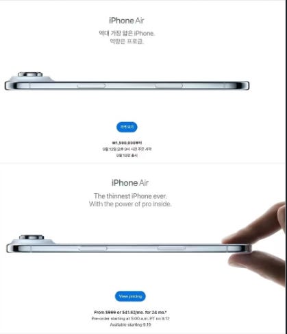
Apple’s recent advertising campaign for the iPhone 17 Air in South Korea removed a “pinch” hand gesture from its global promotional images to avoid a cultural backlash. In Korea, the pinching hand, known as jibgeson or “crab hand,” is considered a misandrist symbol used by some groups to mock men’s anatomy, leading to past controversies and boycotts for brands that used it.
Traditional localization workflows were built for a world where you shipped updates quarterly and human translation/design review was the only option. But we now ship continuously, test constantly, and compete in dozens of markets simultaneously.
This system architecture isn’t about replacing localization professionals, it’s about freeing them to focus on nuanced decision-making and brand stewardship.
The future of localization isn’t human vs AI. It’s humans empowered by AI systems that actually understand culture.
I’d love to hear what patterns you’re seeing that could be systematized. Reply in the comments or DM me. I’m actively researching this space and building prototype agents.
Brilliant Piece. Thanks for sharing - enjoyed this so much ✨
This is going to be exciting to see how ai conforms to it's surroundings.