The AI-Ready Localizer #13: Creating Market-Tailored Visuals with ChatGPT Atlas + Nano Banana
Turning cross-market visual research into brand-ready creative assets.
When you think about localization, you probably think about words.
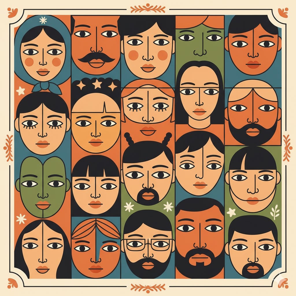
But visuals speak just as loudly — they tell your audience who belongs, what success looks like, and how a brand feels in different markets.
That’s why I started using ChatGPT Atlas to run visual intelligence audits across markets.
Atlas helps me quickly analyze how brands portray people, color, and style, and how these choices differ from country to country.
What ChatGPT Atlas can do
ChatGPT Atlas is OpenAI’s new research and analysis workspace inside ChatGPT that lets you explore entire topics, industries, or datasets visually and interactively.
It works as your AI-powered research analyst + visual strategist: it searches, clusters, and summarizes information across the web, documents, and visual materials, presenting everything as structured maps of insight.
It’s designed for professionals who need to go beyond single-prompt answers — Atlas builds contextual understanding across sources, letting you:
Map relationships between companies, products, or markets.
Analyze trends, design languages, or cultural signals across regions.
Extract recurring concepts or visual motifs from images or websites.
Organize findings in “Collections” and share them as research summaries or creative briefs.
Atlas can act as your global visual research assistant. A structured way to analyze and compare how brands represent themselves visually.
In one session, it can:
Scan brand websites you name (by industry + market).
Describe the demographics and ethnic diversity of people shown (based on observable visual traits, never assumptions).
Identify key visual features — color palettes, light temperature, composition, illustration vs. photography.
Summarize regional visual trends and tone of communication.
Output a structured report (tables, color swatches, and cultural notes).
Example: Internet Service Providers (ISPs) across markets
Here’s how I set up my research:
Prompt
Analyze the marketing visuals of leading Internet Service Provider (ISP) websites in Japan, Germany, Spain, the USA, and France.For each market, include:
People represented – Describe gender presentation, age range, group composition (solo, family, friends, colleagues), and visibly represented ethnicities (e.g., East Asian, White European, Black/African descent, South Asian, Middle Eastern, Latin American, Mixed). Base this purely on visual observation — do not infer nationality or identity.
Style cues – Lighting, framing, setting (indoor/outdoor, lifestyle vs tech), realism vs illustration, level of warmth, and energy.
Color palette – Provide dominant, secondary, and accent colors with approximate HEX values and describe their function (background, CTA, text).
Creative brief – One-sentence summary of how the market visually communicates “connectivity” and “trust.”
Return results in a table:
Market | People in Visuals (observable demographics & ethnicities) | Style Cues | Palette (Dominant/Secondary/Accent w/ HEX) | Creative Brief (1 line)After the table, summarize 3–5 cross-market insights (e.g., patterns in ethnicity representation, contrast in visual warmth, or design minimalism).
Running this type of audit reveals much more than aesthetics:
it shows whose faces appear in “global” campaigns, which stories dominate, and how brands visually translate the same concept — “speed,” “security,” or “connection” — into culturally specific imagery.
You’ll start to notice:
How representation differs (e.g., Japanese ISPs may favor tech-focused young professionals, while Spanish sites show mixed-ethnicity families).
How color temperature shifts (cool tech blues vs. sunlit lifestyle warmth).
How lighting and tone affect perceived trust and approachability.
Example output (sample)
Market: Japan
People: Predominantly East Asian adults (20–40), tech professionals, solo or small groups, gender-balanced.
Style: Clean indoor setups, minimal props, bright white and blue tones.
Palette: #0078C8 (dominant blue), #F4F6F8 (light gray), #FFD700 (accent yellow).
Creative Brief: “High-speed innovation in a calm, ordered space.”
Market: USA
People: Broad ethnic mix (White, Black, Asian, Hispanic), age range 25–55, families and diverse workgroups.
Style: Dynamic, high contrast, mix of lifestyle and tech close-ups.
Palette: #002855 (navy), #E41E26 (red), #F6F8FA (light neutral).
Creative Brief: “Fast, inclusive, energetic connectivity for all.”
Cross-market insights (sample)
Ethnic diversity is more visible in US and French visuals; Japanese and German sites remain more homogeneous in representation.
Warm palettes dominate Spain and France, while cool, minimalist tones define Japan and Germany.
Family-oriented scenes are more common in southern markets; solo professionals in northern ones.
Lifestyle photography outperforms tech imagery in markets where connection equals togetherness (Spain, France).
How to run your own visual audit in Atlas
Pick your sector – e.g., automotive, fintech, education.
List markets – usually 4–6 for contrast.
Ask Atlas to identify top brands if unsure.
Run the ethnicity-aware audit prompt (above).
Add follow-ups, like:
“Summarize biases in representation.”
“Propose inclusive casting guidelines for a global campaign.”
“Normalize palettes for accessibility (WCAG AA).”
Using Atlas this way gives you:
Evidence-based brand insights instead of gut feeling.
Market-specific creative briefs that reflect real audiences.
Visibility into representation gaps — who’s missing from your imagery.
Actionable data for localization, marketing, and design teams.
Now comes the transformation stage:
👉 turning those cross-market insights into new, locally adapted visuals for our brand using Nano Banana.
What Nano Banana is
Keep reading with a 7-day free trial
Subscribe to The AI-Ready Localizer to keep reading this post and get 7 days of free access to the full post archives.


