


Design Once, Regret Never: The Global UX Guide
Design smart from day one—or brace yourself for multilingual mayhem.


Localization is a shape-shifter—it’s an engineering problem right up until the moment it becomes a business growth lever.
Designing with a global mindset is survival. It’s also, let’s face it, a way to not have your product look like it was put together by someone who thought “right-to-left” was a political alignment.

In order to discuss all things design and i18n, I’ve connected with some amazing UX designers on Substack, and they’ve been incredibly generous in sharing their experiences with me.
highlighted a significant difference between products designed with internationalization (i18n) in mind from the outset and those that begin with a single-country focus. When a product starts off targeting only one local market, i18n is often not a priority.However, when these products evolve toward a global strategy, they often face significant challenges retrofitting i18n and localization into their existing infrastructure. In contrast, products built with a global vision from the beginning take a different path.
This early consideration allows for smoother scaling as languages are added, even if the localization effort grows over time. Starting with i18n built into the foundation sets up a product for long-term global success.
“I knew we’d need to support multiple languages, I built the system with that in mind. This meant defining design patterns for things like: punctuation, date, and time formats […], address field, content length and responsiveness for different languages. […] For handling right-to-left languages, we redesigned a few key screens in Figma to simulate RTL layouts and better understand the behavior.”
Building on the previous insights,
further highlights some of the key complexities and unique requirements that come into play when designing for global markets:US has Zip codes, EU has postal codes, and address format might also be different, so we create multiple versions of same page/design as a part of the project. It is challenging, because we are working towards designing for 9 languages, including English.
Another key point
highlighted was the importance of cross-functional collaboration.Designers worked hand-in-hand with the localization team and customer support to ensure consistency — not just in the product UI, but also in email communication, help content, and more. We even built localization guidelines into the design system, so everyone had a clear reference.
This project […] brought together design, development, and business strategy in a really meaningful way — and reinforced how essential it is to include design in localization efforts from the beginning.
A standout insight that serves as a powerful reminder that early collaboration and strategic global thinking aren’t just possible—they're essential to preventing future challenges.
And yet, as
puts it:Not every company I worked with had internationalization in their mind.
This still appears to be the reality for many companies, as
rightly points out.In the early stages of a product, it’s incredibly hard to prioritize internationalization. The focus is almost always on finding product-market fit, validating the idea, building monetization — and usually for one specific region or audience. That’s why full-scale localization usually comes later, once the product is stable and there’s budget to expand.
So, what can a designer do when localization and internationalization—though essential—are often overlooked, and the decisions aren't really in their hands, but driven by broader business priorities?
I do think designers can make small but meaningful choices early on: using established patterns, leaving space for dynamic content, and ensuring good accessibility (which I consider the best form of universal design).
And, as with most things in life, experience is likely the most valuable asset.
After localizing for RTL languages and working with dynamically translated content, I now always design with a little more flexibility — things like planning for text expansion or making sure mirroring won’t break the layout.
Unfortunately, not all designers have had meaningful experience with international products—and that makes a big difference.
A lot of designers have never worked on international products, and it really shows in how little education or content exists around it.
In fact,
found so few resources on RTL locales that she ended up creating her own guide—amazing!Kristina also offered a grounded perspective on why creating tailored experiences for each market may seem ideal—but it’s not always feasible and often comes with significant cost and complexity.
People are emotional, and localized experiences feel more personal. But it comes at a cost: it’s time-consuming, expensive, and complex to maintain across teams and systems.
That’s why many companies—especially in the early stages—tend to adopt a “one-design-fits-all” approach. It’s only when the company reaches a certain level of maturity and has significant resources available that true hyperlocalization and market-specific design adaptation become viable options.
But with the rise of AI-driven design tools and smarter internationalization strategies from the start, could this dynamic be shifting? If companies embed global thinking early on—supported by AI to automate and scale aspects of localization—we might reach a point where real hyperlocalization is no longer a luxury, but a practical choice in key markets. The question is no longer just if it's possible, but how soon it can become the norm.
Indeed,
brings a experience-driven perspective to the conversation. With a strong focus on user behavior, cultural context, and practical rollout strategies, he highlights why a one-size-fits-all approach often falls short. As he explains:There may be exceptions, but generally speaking, I prefer variations tailored to specific markets from the UX standpoint. There would be many potential differences, such as culture, language, user mental model and behavior, and policy. Not to mention, internationalization may not happen at one, but rather over a longer course of time. So from an experimental point of view, it also makes more sense to focus on one market's UX at a time.
A perspective shared by UX strategist
, as someone who practises in Canada with 2 official languages (French and English):I am very mindful of the need to pay attention to 2 target audiences.
And beyond just text expansion concerns, she really hits the nail on the head when she says:
We also need to be mindful of the use of icons and metaphors which do not always translate from one culture to the next.
That’s why:
While sometimes it is possible to create a "generic" version for the international market - by being careful about the choice of words, names, pictures, etc, - there are times it can be more cost-effective to create specific version for each local market.
At the end of the day, localization often falls into a messy middle—it ultimately depends on how the business operates. And here,
, true to her strategic mindset, asks the right question to uncover the real issue:Is there a central "owner" of this product? Or do they have localized operations?
When content management is handled locally, it makes far more sense to design and maintain localized versions—treating each as a distinct product that aligns with overarching, organization-wide guidelines.
is absolutely right—sometimes it all comes down to how the company’s set up. And fair play to her, she summed it up beautifully.In sum, the consideration is more on the business and operational level rather than simply a design decision.
Wow! Those were some mighty insights!
Wait a second—did I thank all my amazing contributors yet? Jaysus, I almost forgot! Huge thanks to each and every one of you—you’re absolute legends!
Now, let’s keep going and unravel a few of the trickier challenges that every design team runs into when designing for a global audience. And who knows—maybe we’ll help bridge the gap where resources are still a bit thin on the ground. Even if you’re a designer working in a business where hyperlocalization isn’t an option, you can still make smart, strategic choices. Let’s take a look at the key areas where your decisions can truly make a difference.
So what gets mangled when global design isn’t part of the original blueprint? There are typically 2 aspects to adapt for…

Text Expansion & Layout Panic: When Words Won’t Stay in Their Boxes
Some languages just can’t help themselves—they need room to stretch. Take German or Finnish, for example: they love long compound words that make your neat little buttons burst at the seams. A simple English “Settings” becomes the mighty “Einstellungen” in German, and Finnish isn’t exactly known for brevity either.

On the flip side, many Asian languages—like Chinese, Japanese, or Korean—tend to pack meaning into fewer, more compact characters. That means you’ll often see layout contraction instead of expansion, with tiny bits of beautifully dense text floating in fields that suddenly feel far too spacious.

To illustrate these differences, the W3C provides a comparative table showing how the word "views" translates across various languages, revealing significant variations in text length .

Pro tip: Your tab shouldn’t look like it’s trying to escape the screen. Design buffers. Use dynamic layouts. And no, truncating isn’t the answer. That’s how “Delete Account” becomes “Delete A...” which is... concerning.
Never take for granted your text length will remain the same.

Even a word as short and common in UI as “On” or “Off” can end up significantly longer in translation. This isn’t just due to the naturally longer length of some target languages—it also stems from structural differences. Many languages don’t use phrasal verbs, so instead of translating just “On” or “Off,” they often require the full phrase, like “Turned on” or “Turned off.”
Languages like German and Danish often form compound words by combining two or more words into one—what might be two separate words in English becomes a single, often very long word. This can break layouts or cause awkward wrapping in your UI.

Tip: To handle this gracefully, consider implementing automatic word-breaking with the CSS hyphens property.
Note: Hyphenation is language-specific, so be sure to include the correct lang attribute in your HTML (e.g., lang="de" for German). The hyphens: auto; setting relies on this attribute to apply the appropriate hyphenation rules. Without it, your content might not break correctly—and that could impact both readability and design.
Designing for English is like designing a bento box. It’s neat. Predictable. Short. Then you bring in French, or Portuguese, or Finnish, and suddenly it’s Thanksgiving dinner in a lunchbox.
If you don’t build flexibility into your layouts—both vertically and horizontally—your design team will be playing Tetris with buttons, labels, and error messages.
Spoiler: Tetris was Russian. Play accordingly.
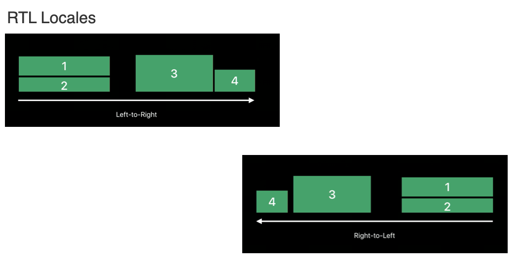
Right-to-Left Languages —Where Layouts Go to Die
Bidirectional text? Welcome to the chaos zone. Arabic, Hebrew, and others aren’t just “flipped” versions of your English interface. They’re linguistic gymnastics that turn single-line sentences into a spaghetti bowl of direction changes.
Right-to-left languages can be particularly tricky in digital design because they often involve bidirectional text—mixing left-to-right and right-to-left scripts within the same line.

Now, let’s unravel the quirks of RTL locales.
The primary distinction between left-to-right (LTR) and right-to-left (RTL) scripts lies in the direction content is presented:
LTR languages (like English) display content from left to right.
RTL languages (like Arabic and Hebrew) display content from right to left.
This directional difference impacts not only text but also how UI elements such as icons, timelines, and images are displayed—especially those that represent sequences or motion.
When switching a UI from LTR to RTL (or vice versa), this process is often referred to as mirroring. An RTL layout is essentially a mirror image of its LTR counterpart, impacting layout, text alignment, and graphical elements.
However, not everything should be mirrored:
Numbers remain in their standard direction.
Untranslated (LTR) text, such as URLs or brand names, should retain their original left-to-right format.
It’s essential that each piece of text respects the directionality of its own language. Mixed-direction content (like English words in an Arabic sentence) should be handled with care to ensure proper display and readability.
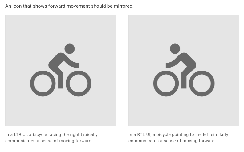
Besides, when adapting images and icons for RTL interfaces, not everything should be mirrored automatically. Visual elements that convey direction, especially those related to time, motion, or navigation, often need to be flipped. For instance, back and forward buttons must be reversed: forward points left in RTL, while back points right. Similarly, an icon of a bicycle or arrow indicating movement should flip to preserve the sense of “forward.”


However, not all images should be mirrored. Icons with slanted elements, like slashes indicating “off” states, are typically not flipped, as they retain their meaning across languages. Icons that reference physical objects, such as keyboards, headsets, or coffee cups, should remain unchanged, since these don’t convey directional meaning. The same applies to icons like clocks or refresh buttons, which rely on circular motion—the clockwise direction stays consistent in both LTR and RTL cultures.

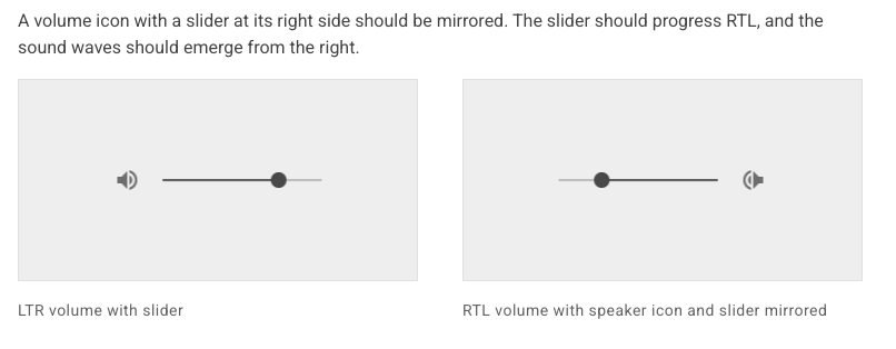
Some icons also require special consideration. For example, the volume icon with a slider should be mirrored so that the slider progresses right-to-left and the sound waves emit from the correct direction. Icons that include text-like elements—such as chat bubbles or paragraph indicators—should reflect RTL formatting conventions, including right alignment, paragraph indents, and ragged line ends.
In summary, mirroring is context-dependent: mirror directional and time-based elements, but retain the original orientation for physical objects, circular motion, and universally understood shapes.
Below is an overview of how each platform supports bidirectional text and layout.
Android: Available
iOS: Available
Web: Available
Flutter: Available
If your asset catalog can’t handle RTL mirroring or image adaptation, you're basically sending your designers into battle with paper swords.
Cultural UX—Because Not Everyone Lives Inside an Apple Store
Let’s kick things off with a word that my spellchecker refuses to believe is real (but trust me, it is): localizability.
In a nutshell, when we talk about the localizability of visuals in product design, we’re talking about making sure our lovely images, illustrations, and icons don’t accidentally spark an international incident. It’s all about whether the visual message we’re trying to send actually lands the right way in different markets and cultures.
Most of us are used to thinking about localization in terms of text—and fair play, that’s important—but visuals matter just as much. Take white chrysanthemums, for example. You might see them as a symbol of love and loyalty (I did!), but in some places, they’re more closely tied to funerals and mourning. Not quite the vibe you were going for, eh?
Ideally, we’d be able to check in with folks from all sorts of cultures and communities before anything goes live. But sure, that’s not always doable. So, in the spirit of being helpful, I’ve put together a handy checklist of things that might trip you up when it comes to visuals that don’t quite translate—and that can take a bite out of your UX. Let’s dive in.
Hand gestures
You’ve seen them—bright, cheerful illustrations of folks throwing hand signs on colourful backdrops. Lovely stuff... until someone spots the "OK" sign and reacts like you’ve insulted their granny. 👌
Truth is, hand gestures can be minefields.
Pro tip: If in doubt, leave the hands out.
Faces and expressions
Smiles, grimaces, emojis galore—they’re all part of how we communicate. But here’s the catch: not every facial expression means the same thing everywhere. That beaming grin might be read as polite, awkward, or even suspicious depending on where you are in the world.
So, while your illustration might be charming in one culture, it could fall flat—or worse, be misread—in another.
Colour meanings
Ah, colour—the easiest way to brighten up your UI, and the fastest way to accidentally send the wrong message. We might associate red with love or energy, but in some places, it can symbolise danger or even mourning. White often seems clean and minimal to us, but in certain cultures, it’s linked with death and funerals.
So before you splash a bold palette across your designs, it’s worth asking: “What does this colour say to someone in another part of the world?” Because while that fresh green might scream eco-friendly to you, it might mean something entirely different elsewhere.
Clothing and accessories
A cute winter hat or a bikini on the beach might look totally normal to you—but for another market, it could be out of place, insensitive, or just plain confusing. Clothing carries cultural weight, and some items (like religious symbols or national dress) can’t be tossed into a stock image without context.
If your visuals include people, take a moment to think about how they're dressed. Could it be misinterpreted? Is it appropriate for all the regions you're targeting?
When in doubt, choose neutral, inclusive visuals—or tailor them thoughtfully to fit the target culture.
Animals and objects
We all love a good mascot. But animals can carry vastly different meanings depending on where you are. Owls might represent wisdom in one place and death in another. Pigs might mean wealth, luck, or—well—something less flattering.
Same goes for objects: lucky charms, home items, or food can evoke comfort in one culture and confusion or offence in another.
I still remember the day I got an email from at least ten linguists, all chiming in to say those background birds would only add confusion. One even said, “They’ll think you're selling birds!” Turns out, in many target markets, early bird gets translated without the word bird at all. You couldn’t make it up!

The Button Blunder: A PlayStation Tale
Back in 2020, Sony made a bold move in Japan: they switched the PlayStation 5’s confirm button from Circle to X—just like we use in the West. Grand idea for global consistency, right? Well... not quite.
You see, in Japan, Circle has meant “yes” for decades, while X was a clear “no”. It's not just a habit—it’s practically in the DNA of Japanese gamers. So when Sony flipped the controls, it was like telling people to drive on the other side of the road overnight.
To make matters worse, many Japanese PS5 games stuck with the old setup. So the system said one thing, the games said another, and players were left pressing all the wrong buttons and wondering what fresh madness they’d bought into.
This seemingly small UI decision triggered confusion, frustration, and backlash from loyal fans. Some estimates suggest that Sony’s brand favorability in Japan took a significant hit, and reports hinted at a dip in early domestic sales—with industry analysts estimating a potential $5–10 million revenue loss due to slower adoption and higher customer support overhead in the region.
The lesson? You can’t just steamroll cultural norms for the sake of consistency. Design without context, and you’ll confuse the very folks you're trying to serve. In short: know your symbols, know your people—before you go switching their circles and crosses around.
Localize like it’s 2025
Use real Figma previews. Stop copy-pasting translations like it’s 1999.
Invest in localization tools that keep your future self from rage-quitting—and loop in your L10N/i18n teams early. The earlier they’re in the loop, the fewer fires you’ll have to put out later.
Pro Tip: Pseudolocalization of Figma files can be streamlined by using a connector to your TMS, allowing you to simulate translated content early in the design process and catch layout or UI issues before localization even begins.
When you design for the globe, your product doesn’t just survive international launch—it thrives.
So ask yourself: Would you rather spend three weeks firefighting your German layouts, or three hours designing with flexibility and multilingual sanity in mind?
Design smart now. Or debug multilingual mayhem later. Your call.
 | A guest post by
|
 | A guest post by
|
 | A guest post by
|
 | A guest post by
|
 | A guest post by
|
Still haunted by German translations in my nightmares 😅
Love the language—just not in my UIs!
Surprised by the depth of this article. Such an interesting topic!